
FOODSTAR:
Cooking instructor Android application
Objective:
The aim of the project was to design and develop an android application which would work as “cooking instructor”, to help the user follow the steps of a recipe and prepare the food as intended.
This application was targeted at, but not limited to, people who have little to no understanding of cooking by following a recipe. We also tried developing an application that enhances the experience of searching for recipes and cooking it, for users with all levels of experience.
Team Members:
Srinath Ravichandran ⋅ Nisha Kumari ⋅ Dharmanshu Kamra ⋅ Vishal Gaurav
My Role:
Experience Design ⋅ Research ⋅ Wireframing ⋅ Affinity Diagramming ⋅ Prototyping ⋅ User Study ⋅ Team Facilitation
Duration:
10 Weeks (Jan – March 2016)
Background:
The motivation for this application came from the recent personal experiences of the team members, who had been recently exposed to the troubles of cooking as novices, who did not have the luxury to gain a deeper understanding of cooking and witnessed the drawbacks of that in their own lives and the lives of their friends.
As all of them were international students as well, they were exposed to cuisines and produce that they weren’t familiar with eating either. Hence, those of them that had cooked back in their home countries, faced new difficulties. Clearly, there was a need for an application that would help users be able to cook with ingredients and techniques that they had never used before while also allowing them to handpick the recipe according to their custom requirements.
Project Context:
The project is the first of its kind in trying to provide help in following the steps of a recipe. The scope of the project was to design and develop the interface for an smartphone application that would allow user to follow through at least the basic workflow of searching for a recipe, assistance in making decision about the recipe, viewing the steps of the recipe, assistance in following intermediate steps in the recipe and being able to rate the recipe for posterity.
The project developed accomplished this task and also provided the user with a clean interface which enhances the user’s experience in every task performed be it browsing for recipes or searching for a specific recipe, or for trying to follow the steps of the chosen recipe while having little to no cooking experience at all. The project does expect the users to have at least basic skill of working an Android smartphone.
Design Problem:
Our application is targeted to enhance the cooking experience of the users who are a novice at cooking but pro-level at using technology. This basically refers to users who know how to work with smartphones but are new in the area of cooking.
Regardless of this, everyone has a different approach towards cooking and experiences a different level of difficulties in the process. Through our application, we want to give users a simple way to follow the recipes they like and come up with an awesome dish. Our target users were from varied perspectives of lives, including but not limited to teenagers, business professionals, and students.
As we aim to simplify and enhance the experience of cooking for users, we decided not to take expert cooks into consideration as they often have the expertise and knowledge that our application is targeting at. So, our main effort was to design a simple yet effective interface for the users.
Since we were to take into consideration the users who are not very used to cooking, we planned to give details of each step along with the basic instruction as well. Suppose the recipe steps involved using homemade salsa but gave no information about how to make the salsa itself. We planned to design our application in a way that gave the user information about such steps instead of the user going to another recipe and finding out an alternative.
We aimed at designing the application in a way that the user spent less time fussing around on a phone just to find a recipe, and more seamlessly experience a way that allows them to easily get what they need and move on. The design should be such that it solves the existing problems, organizes information in a meaningful way, and make things simple enough for people to understand it easily. Typically the users were college -aged young adults who aren’t interested in getting too fancy with cooking, but rather want the basics to figure out how to start cooking. Hence, we focused on the common simple and healthy recipes.
We wanted our application to be majorly based on the following properties of User Interface:
- Clear – The whole purpose of our application was easy interaction with the users. The communication should be meaningful and functional. If the users cannot figure out how the application works in the first place, the whole idea fails. So, designing a clear interface was our priority.
- Concise – We had to be careful about not oversimplifying things and hence cluttering the interface with way too many information than required. Hence, we designed it to be clear plus concise.
- Familiar – We wanted the users to present with a familiar interface in place of an altogether new interface where the user would have to learn a lot about the interface even before using it. We identified things that the user is familiar with and integrated it into our user interface.
- Consistent – We believed that a level of consistency that an interface should maintain throughout the application. This allows the users to develop usage patterns.
- Efficient – A good interface should always be efficient. It should allow the users to perform the required functions faster and with less effort. The best approach for this is to know exactly the user is trying to achieve, and then let them do exactly that without any complications.
Design and Justification:
The design was finalized after the brainstorming session. Everybody was asked to draw sketches worth at least two A4 sheets of paper. The team took over 40 minutes to complete the exercise and think of out-of-the-box ideas. The design was based on the user research we conducted. We used following methods for performing the user research: Fly On The Wall, Surveys and Questionnaire, and Five whys.
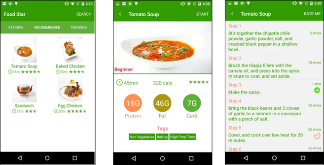
Home screen:
We decided to have three tabs for the users namely: Starred, Recommended and Trending. Starred tab refers to the recipe that the user looks at most often or has saved it as favorites. Based on users searches and the filters he/she uses to find a recipe, we display the recipe that we think the user might like it. The recommendation tab in our application displays this. In addition to these, we have a trending tab where the recipes that are in trend are displayed. If there is some popular event coming up, such as Easter or Christmas, the recipe related to these will be displayed on the trending tab.
Recipe Overview:
When the user chooses any recipe from the above mentioned three tabs or the search field, it goes to the related recipe page. The name of the recipe is displayed in the header and there is a large image of the recipe. This helps the user to visualize the recipe and decide that he/she wants to proceed with the recipe or not. This page also provides the broad view of the nutritional content of the recipes. Along with showing the level of expertise required for cooking the chosen recipe, it also displays the related time and total calories in the dish. This information plays a major part when the user is still in the process of choosing a recipe to cook. Once the user decides to cook the selected recipe, he/she hits the START button at the top-right corner and is redirected to the recipe details page. We have the steps associated with the recipes. There might be the case that some steps are not common to the users for cooking. For those purposes, we decided to give an additional detailed page for the user. The steps, which have such detailed description, have an arrow associated with them. The user can click them and go to the detailed steps page. For the steps, which have time, associated with it, such as baking for 10 minutes, we have timer functionality. The timer pops up and the phone vibrates to indicate the timer is off. There is a RATE ME button on the top left corner from where the user can rate the recipe.
Recipe Details:
In this case, there was a step of using salsa but there was no description of how to make the salsa. So, instead of going to the new recipe of salsa the user can just go to the detailed steps page and it describes how to make the salsa and also has an attached image.

We understand the users of our application belong to a variety of backgrounds and their preference might be very different. To cater to those preferences, we introduced a number of recipe filters in our application. The user can search by just using a text box (as used by a regular Android application, hence the consistencies maintained). Or there is an option of advanced search. This option allows users to apply a number of filters in their search. We have three broad categories of filters namely: Time Filters, Nutrient Filters, and Rating Filter. This gives them the freedom to apply filters and see the results of recipes only what they are really interested in, instead of being cluttered with all the recipes. Thus, this makes our application concise as well.
User research and Findings:
Who are our users?
The main focus of studying the users was to determine our core users who will constitute around 90 percent of our user base. We tailored our application based on this input and found it to be useful for the targeted users. Table 1 describes the division of our users based on their technical and cooking expertise.
| Cooking | Newbie | Mediocre | Expert |
| Technical | |||
| Newbie | NO | NO | NO |
| Mediocre | YES | YES | NO |
| Expert | YES | YES | NO |
This table shows targeted users and users which are not taken into consideration.
User Research
We applied following user research methods to get more information about the features most important them.
Fly on the Wall:
We applied this method to 5 persons to find out the elements and features, which can be most critical while actually using a cooking app. We found out some major features, which we included in our Hi-Fi prototype. Following are few features, which are the results of Fly on the wall method.
- Recipe type (Vegetarian, Vegan, Gluten-free etc.) and Recipe time are very important factors when deciding on a recipe.
- Reviews and utensils required for a recipe.
- Cooking expertise required for a particular recipe.
- Always on screen, while the user is in most critical steps of the recipe.
Five Whys:
The major goal of this study after Fly on the Wall process was to get insights into specific details about the steps user is following apart from what is mentioned in the recipe they are using. We got a lot of clues to polish our features such as
- Adding reviews on the Recipe thumbnails.
- Adding time and images to the recipe thumbnails.
- Adding Trending, Recommended and Starred section to the Home/Main screen.
These methods helped us a lot by getting to know the user and we got key features to be included in the application but after the brainstorming session with our group members we found that some features were contradicting with each other, so we conducted questionnaires and surveys to clear out these questions.
Surveys and Questionnaires:
After applying the above two methods of user research we wanted to clarify few questions, which we found during brainstorming sessions. Following are the questions which we asked the users that helped us finalize our feature sets. The following table (Table 2) shows the answers, which we were able to clarify after the survey.
| Questions (Asked in survey) | Answers |
| Whether reviews should be included in recipe details? | YES |
| Should we include some functionality to reduce steps to show recipe details while the user is cooking? | YES |
| What kind of details should we put in recipe detail view of the application? | YES |
| Does user look back at their recipe while cooking? | YES |
| Does user need multiple results for a single recipe? | YES |
Heuristic Analysis:
Heuristic Analysis is aimed at quickly testing the hi-fi prototype that we had developed without the use of extensive field trials. As we had discussed earlier our application is targeted towards users with medium to expert level mobile user experience while having practically no or moderate level cooking experience. Finding users would not be a problem, however, logistics have to be maintained if we are to find correct users to do proper testing. Hence we resorted to heuristic analysis ourselves to find out major bugs/design issues in our application. We decided to split the task into 5 ways so that each one of us can concentrate on one heuristic task. A couple of major issues that we found were the following.
- Minimalistic design is very difficult. Creating a user interface that was minimalistic and at the same time informative was very difficult. We had to go through a couple of iterations to narrow down the final look of the interface. Our original recipe screen had all the information present on one screen. However, we found out that having all the information in the same location meant that we were using up valuable real estate space at the same time. Hence we decided to come up with a redirection-based scheme that led users to another screen when they required more information.
- Consistency is king. Android application space has a lot of users and hence in order to make sure that users had a seamless experience using our application meant that we stuck to the general conventions of how buttons on the screen operated. A couple of glaring bugs were found that we had to fix immediately so that they did not ruin the actual experience of the user.
- Returning from errors had a lot of corner cases that had to be fixed. For example, when users were allowed for text input with respect to searching for recipes, the system actually had bugs that led to it crashing or providing no feedback whatsoever that would have led to users having a really bad experience with the application. Bugs of this sort were fixed with the highest priority since we believed all these were very crucial to be fixed to make the application of the highest quality.
Re-Iterating the Design:
Based on the feedback we received on the first iteration of our hi-fi prototype we made a list of alterations and features, which we could implement, in the next iteration of our product. The points are arranged in decreasing order of priority.
- The nutritional detail screen should be more detailed and should utilize modern data visualization structures such as pie charts and graphs to display the information in the best possible manner. The following figure illustrates a rough design of what the screen can potentially look like. A visual representation such as this not only looks attractive but also relays complex nutritional information in the most possibly intuitive manner.
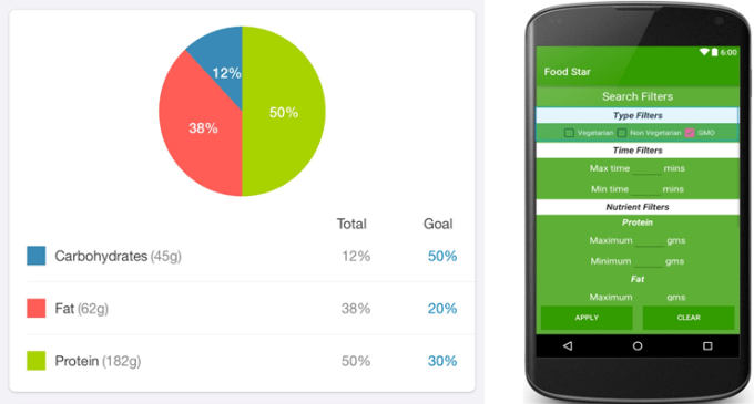
- Implement advanced search filters, which can filter out vegetarian and non-vegetarian dishes. This would be a simple checkbox on our filters screen. We also considered altering the design to have a small design change, which can indicate whether a dish is vegetarian or not. This can be a simple symbol, which is indicative of the same. A sample of this design change is shown below.
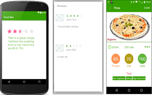
- Implement reviews. We already have a rating system but market research has shown that most avid cookers refer to reviews to make an educated guess when they are trying to finalize a recipe. In order to encourage (but not ensure) that reviews are made only after completing the recipe, the review is added a limited character text box can be added to our Rating view where the user can type in his experience with the recipe. A sample of this design can be found below. In order to view the written reviews, a screen would have to be made which would list all the reviews for the recipe. A prototype of this screen is given below.
- Add video and image slideshow for recipe detail and recipe steps screen. The recipe step detail screen is used to describe in details of a particular instruction of the recipe, which might not be very clear. This currently supports text and single images. It can easily be modified to show videos, which would be more engaging to the user and also possibly more detailed than simple text.

- Thumbnails for images on the app. Several recipe images on the app are scaled for size and look stretched and ugly. The app can instead create cropped thumbnails for the appropriate size so the images go well on the screen.